This is Part 1 of a 3-part series on the possible democide that occurred in the US, and possibly worldwide, under the guise of COVID-19. Part 1 includes an introduction to the issues covered in this 3-part series, and goes over basic death data for the “Covid years” from the official US mortality records.
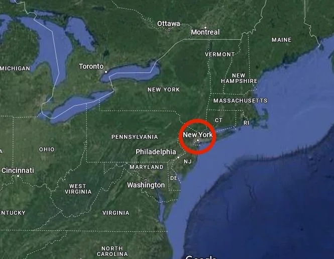
Read MoreThere were over a half-million more US deaths in 2020 than there were in 2019, according to the official mortality data—by far the largest yearly increase in deaths since at least 1968. 50,000 of those excess deaths happened over 8 weeks in 25 counties in the New York City metropolitan area, all of which experienced more than a 100% increase in deaths in April 2020—some more than 550%. How many hypotheses about the cause of excess deaths in 2020 are consistent with the NYC data? Is the data consistent with the idea that toxic treatment protocols were primarily responsible for excess deaths? Is it possible 1.5 million excess deaths in 2020-2023 were fabricated in the official records?
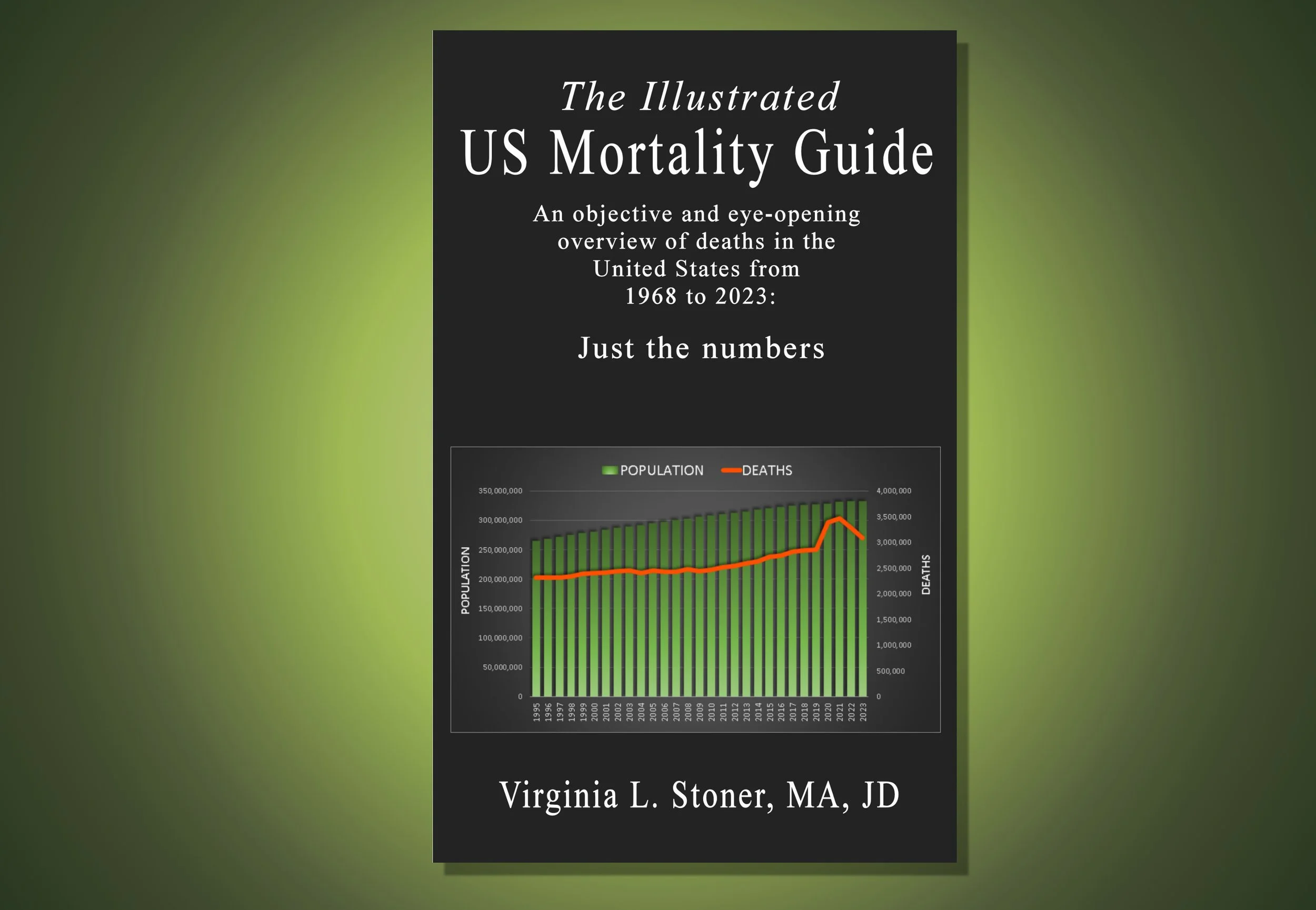
Read MoreMaybe I’ll be accused of exaggeration or self-aggrandizement, but The Illustrated US Mortality Guide: An objective and eye-opening overview of deaths in the United States from 1968—2023: Just the numbers, is my baby, so I think I’m entitled to be a little delusional about it, especially so soon after its birth. This book baby has been in the making for more than a year, and finally, after seemingly endless additions, subtractions, modifications, and technical difficulties, it is up on Amazon, ready to be adored by all—who will hopefully be smitten enough to buy a copy, in Kindle or paperback—or even both, if they are particularly smitten. This unique book objectively presents the official US mortality data, totally free of opinions or conclusions, and makes it accessible for everyone.
Read MoreThis post is the third in a series in which I look at the characteristics of the death waves that crashed over the US in 2020 and 2021. These death waves impacted different states at different times, and even different counties within each state—something that is important to keep in mind when considering the testimonies of medical and funeral workers. In this post I focus on the causes of death that increased the most during the 6 death peaks, and find a wide range of causes affecting lots of different body parts, with an especially large number of respiratory problems.
Read MoreIn my last post, I identified the months and states where the highest increases in deaths occurred in the United States in 2020 and 2021—the peaks of the death waves. We saw that overall, 90% of excess deaths occurred in 3 places: among inpatients in medical facilities (55%); at home (23%); and in nursing homes and long term care facilities (12%). In this post, I look at excess deaths by age group during the death peaks, and as usual, find some strange and surprising things. I also provide an update on the coverup of excess US deaths, with a spurious claim by Dr. Jessica Hockett that mortality data was fabricated, and from Dr. Pierre Kory , a “debate” about a false dichotomy that excludes the possibility of democide.
Read MoreThere were a series of strange “death waves” in the United States in 2020-2023—especially in 2020 (“the year of the virus”), and 2021 (“the year of the vaccine”). However, the situation was very different in different states, at different times in 2020 and 2021—deaths were extraordinarily high in some times and places, while at other times and places, deaths were normal. In this paper, I identify the peak months and states where excess deaths occurred in the US, and look at the places people died in those months and states—in hospitals, at home, and elsewhere. I hope you find the results as intriguing and thought-provoking as I did.
Read MoreThere’s a group called PANDA that has given some publicity to the NYC mass casualty event recently. Naomi Wolf interviewed Jessica Hockett and Jonathan Engler of PANDA, who are promoting the idea that the mortality data in NYC may have been fabricated. Efforts continue to cover up the mass casualty event—I predict they will continue forever, because it was a democide.
Read MoreFor the last 3 years, there has been widespread media silence about the mass casualty event in New York City in Spring 2020, which killed over 50,000 people in 25 counties over 8 weeks, according to Centers for Disease Control (CDC) data. And when the press isn’t silent about it, they are usually covering it up—we’ll look at some examples here. Is the mortality data from the CDC accurate and complete? Is it possible deaths have been falsified to simulate a mass casualty event? I review some possibilities that were proposed recently, and try to narrow them down.
Read MoreIf the CDC’s death records are correct, there was a mass casualty event in New York City and the surrounding area in April 2020, which killed 50,000 people over the course of 8 weeks, then ended just as suddenly as it began. Don’t be surprised if you haven’t heard about it—most people outside the Department of Defense haven’t, and even there, it’s on a need-to-know basis.
Read MoreLately I’ve been writing about several unusual surges in US deaths that occurred from 2020 to 2022. Even though I haven’t looked at all the surges individually yet, I decided to jump straight to this discussion of all the surges collectively, after the high strangeness of the situation hit me. Just how strange were the 2020-2022 “death waves”? Read on.
Read MoreBefore 2020, deaths had a remarkably consistent seasonal pattern in the US. This predictable pattern went totally wonky in 2020, and stayed strange through at least early 2022. Why? I think this disruption in the usual pattern of deaths can provide important clues about what really happened to cause deaths to increase. In this paper I look at the the third of four extraordinary “death surges” that occurred from 2020-2022—this one in August 2021—and consider its possible implications.
Read MoreThe second of 4 death surges that occurred in the US from 2020 through 2022 started in December 2020 and continued for about 13 weeks. This death surge resulted in almost 285,000 excess deaths, compared to the same period a year earlier. Like the April 2020 death surge, it disproportionally affected one state—but strangely, it was an entirely different state, on the opposite side of the country. In this post I look at the numbers for the December 2020 death surge, and I have some more information about the April 2020 death surge as well.
Read MoreAfter my last paper on the April 2020 death surge, I looked deeper and discovered something shocking: the 135,000 excess deaths in the US during the surge occurred almost exclusively in New York and New Jersey. Because the death surge was so localized, 4 out of 5 of the possible explanations I proposed for it don’t really fit! Plus, there’s a new chart comparing the death rate in each state for 2019, 2020, 2021 and 2022. There are a few standouts among the states—but not necessarily for the right reasons.
Read MoreThere have been 1.7 million excess deaths in the US in the last few years, starting with a sudden surge of deaths in April 2020. This death surge is ignored a lot in both mainstream and alternative media, because it doesn’t neatly fit anyone’s narrative. This paper takes a closer look at that first death surge, considers the possible causes, and identifies 4 distinct “death surges” that occurred from 2020-2022. It also looks at deaths by gender among 25-44 year olds—an age group where twice as many men die than women.
Read More


